by Annamária Neag
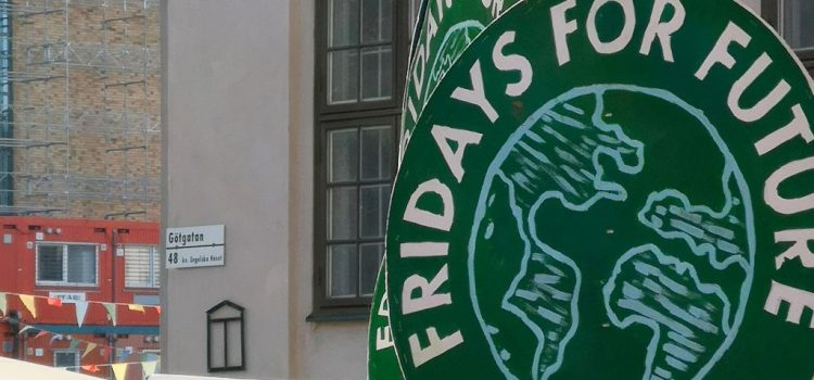
March 19 was a Friday like any other – one might think. But this year, again, young people united under the ‘flag’ of Fridays for Future were protesting for climate justice. This time, “with fresh calls, new ideas and bolder actions”. Because of the COVID pandemic worldwide, children and young people could not get together for the protests, like they did in previous years. Instead, they chose the online route of activism, led by the hashtag #nomoreemptypromises. The Fridays for Future movement started in 2018, when high school student Greta Thunberg began a strike by sitting outside the Swedish Parliament. She was soon joined by other young people and the movement turned global.
In this research project we are interested in how this global movement is present in the Central and Eastern European region, with a focus on the Czech Republic and Hungary. In recent times, social movements tend to start simply with a hashtag. This makes the movement visible and encourages others to join. It was no different with #FridaysforFuture, as their self-presentation show. In line with this, our main aim is to understand how young people use digital platforms to engage civically in these two CEE countries. We want to know how their struggle is represented in the media, and also what type of (media literacy) skills are needed for their online engagement in the cause of climate justice.
At the start of the project then, we needed to agree upon the research timeline, major milestones and deliverables. The next step was then to create a website and design a logo for our project. We commissioned a local Hungarian artist to create a couple of versions for our logo based on the project description and our needs. And this leads us to the question in the title: ‘what’s in a logo?’ One of the first versions of this logo was showcasing a small child holding a placard with the acronyms of the project’s name. This brought about a discussion among the group members around children and young people’s representation (in the media and elsewhere) in this movement. As one of our group members said: we probably need something that goes beyond the usual illustrations of children, something more empowering.
The conceptualization of childhood or adolescence has changed considerably throughout history. Following this tradition, we argue that childhood is a social construct, and for this reason a child-centred research needs to move beyond the usual child-adult dichotomy. By building on intersectionality, we aim to carry out a child-centred project, and one that can involve young people to a large extent in order to understand their reasons, actions and skills in climate activism.
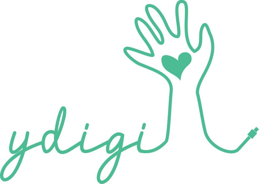
Returning then to the logo we eventually chose: this now showcases the acronym of the project (YDigi), a hand with a heart symbol in the middle and a USB cable. We feel that this artwork now symbolizes both the struggle of the young people to make their voices heard (online) in the climate change debate and our own position towards our research subjects. The raised hand with a heart symbol belongs neither to a child, nor to an adult, but to someone who cares deeply about a cause, in this case, for the planet. Our aim is then to understand both the online discourse on the #ClimateStrike movement and to comprehend the children and young people’s views on fighting for this cause.


